

The Standards for Health Drinks in Korea Bogoshinyak Co., Ltd


Youth Factory
A combination of Youth Factory, the name symbolizes the vibrancy of spring, when fresh sprouts emerge, and metaphorically represents the prime of life—youthful vigor typically associated with one’s twenties.
In a society increasingly shaped by aging populations, Youth Factory embodies the aspiration to restore vitality and youthfulness. The brand represents the creation of youthful energy through products made from high-quality ingredients, leveraging advanced expertise and technology. Produced in state-of-the-art, safe facilities, Youth Factory is dedicated to “manufacturing health” and fostering vibrant, healthy living.
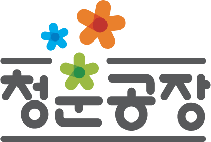
The Meaning of the Color
Orange represents the expertise and innovation behind
health beverages. Blue embodies the energy and vitality
of healthy living.
Green reflects the refreshing vitality and renewal of spring.
The Meaning of the Logotype
The logotype is a core element reflecting
Youth Factory's unique identity,
with rounded typography adding a touch of
individuality and character to the design.
The Meaning of the Graphic
The graphic draws inspiration from the vitality
of spring and the essence of healthy living,
incorporating a capsule pill motif to symbolize a health
beverage crafted with pharmaceutical expertise.


